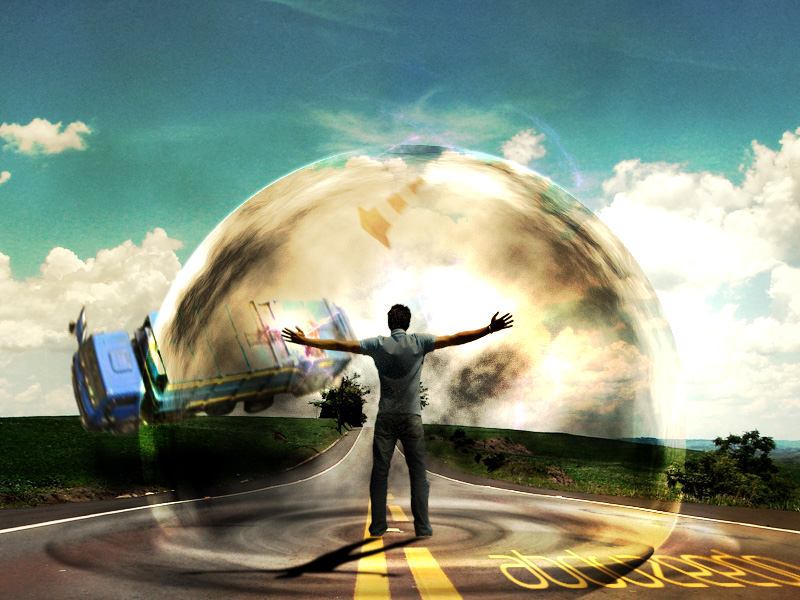
In the early days of Psdtuts, one of our regular authors was a Brazilian designer named Fabio Sasso. Since then, Fabio has gone on to build one of the largest, and coolest design sites on the net. Today, in our effort to introduce some of our newest readers to some of our older content, we have decided to resurrect one of Fabio’s tutorials from April 2008 that demonstrates how to create a powerful mental wave explosion effect. Let’s get started!
Step 1
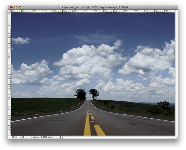
Open a new document. I used 800x600px. Look for a road photo on the Internet. The one I used can be downloaded
here. After downloading, place the photo in your document.
Step 2
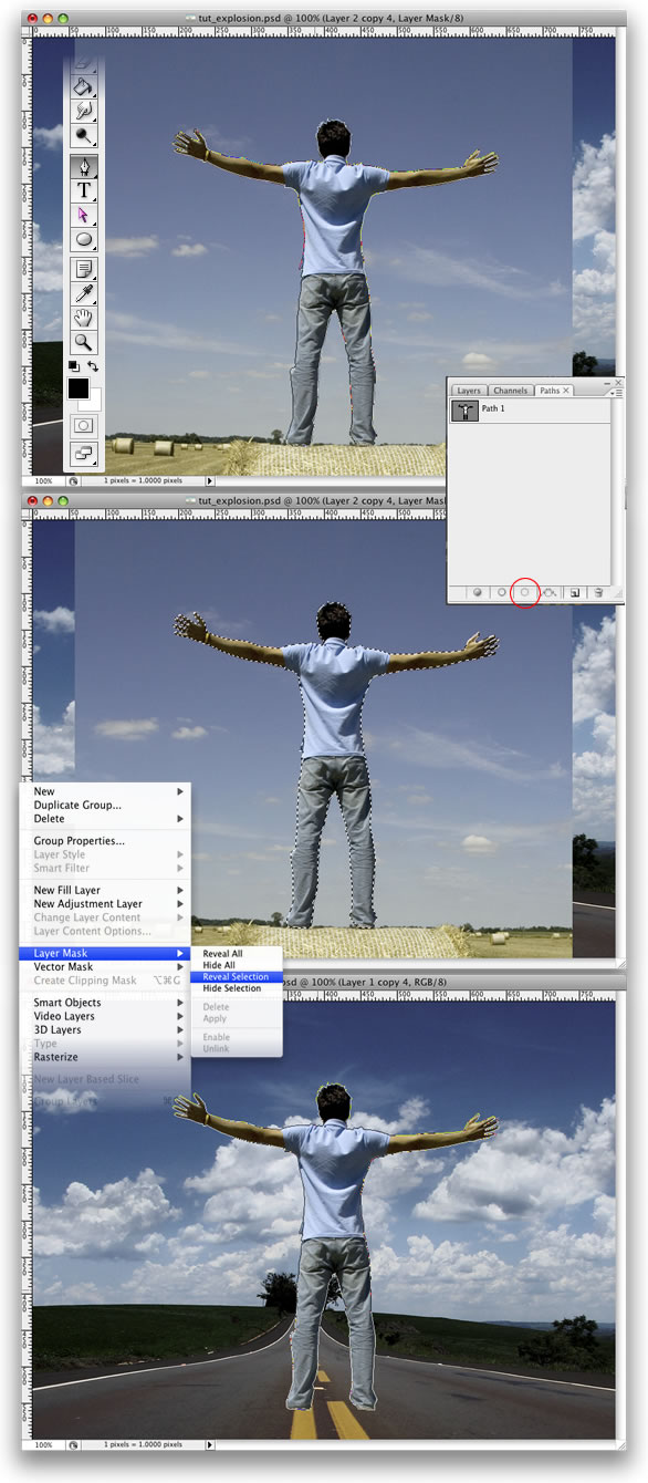
Now we need a photo of a person. The one I used can be found
here. Once you have your photo, it’s time to extract the guy from the background. Using the Pen Tool(P) create a path like in the image below. After that go to the Paths Palette and create a selection from that path. Then go to Layer > Layer Mask > Reveal Selection. Lastly, I named this layer “dude.”
Step 3
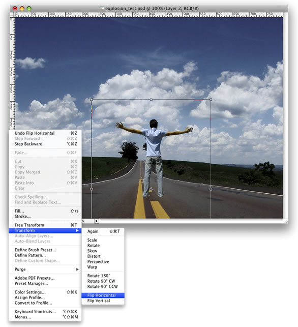
Go to Edit > Transform > Scale and reduce the size of the guy. Then go to Edit > Transform > Flip Horizontal. We do that to match the light direction.
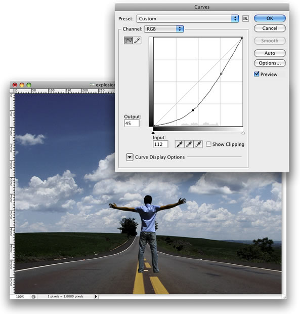
Step 4
Go to Image > Adjustments > Curves. The idea here is to darken the guy a little bit so he will fit better with the background. Use the image below as a reference.
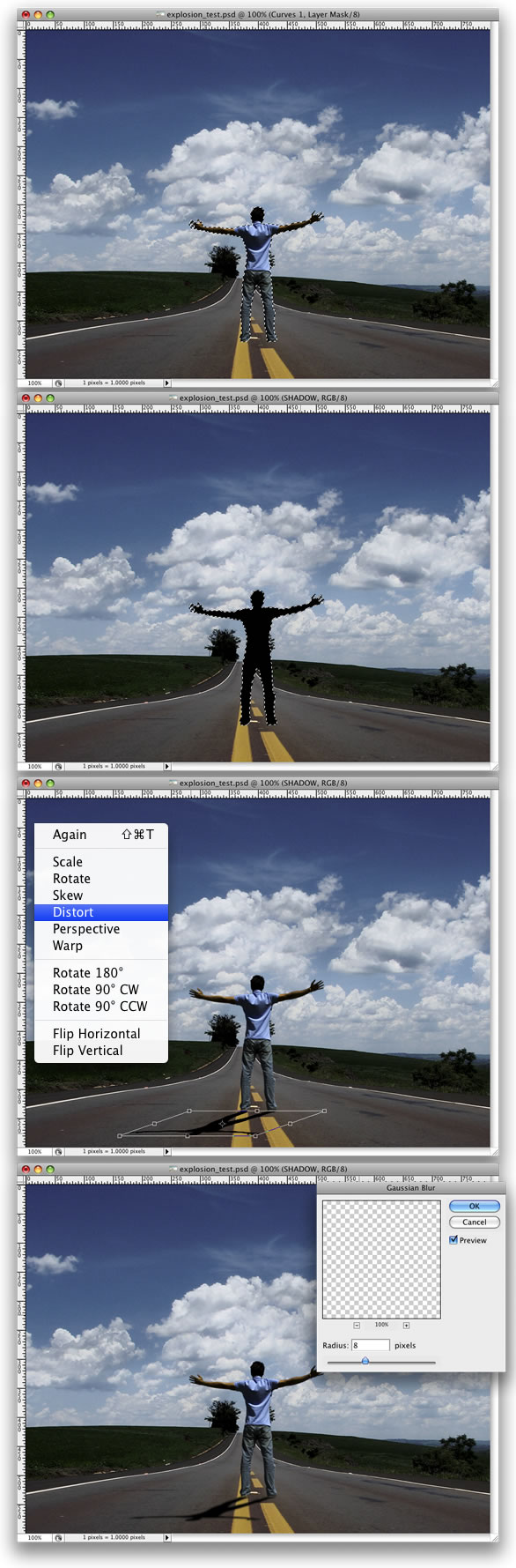
Step 5
Holding Cmd/Ctrl click on the mask thumb of the “dude” layer. That will create a marquee selection of the guy. After that create a new layer. Rename it to “shadow” and fill it with black. Then go to Edit > Transform > Distort and move the vertices to make the shadow in perspective. The last thing here is go to Filter > Blur > Gaussian Blur.
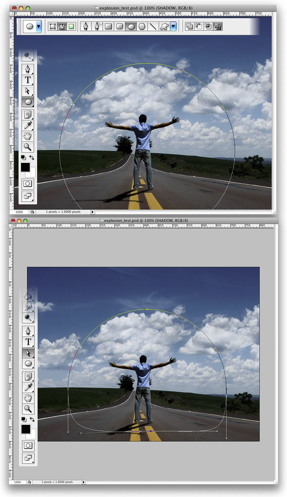
Step 6
Grab the Ellipse Tool(U). Select Paths instead of Shape Layer. Create a Circle, like the image below. After that grab the Direct Selection Tool(A) and adjust the bottom of the circle.
Step 7
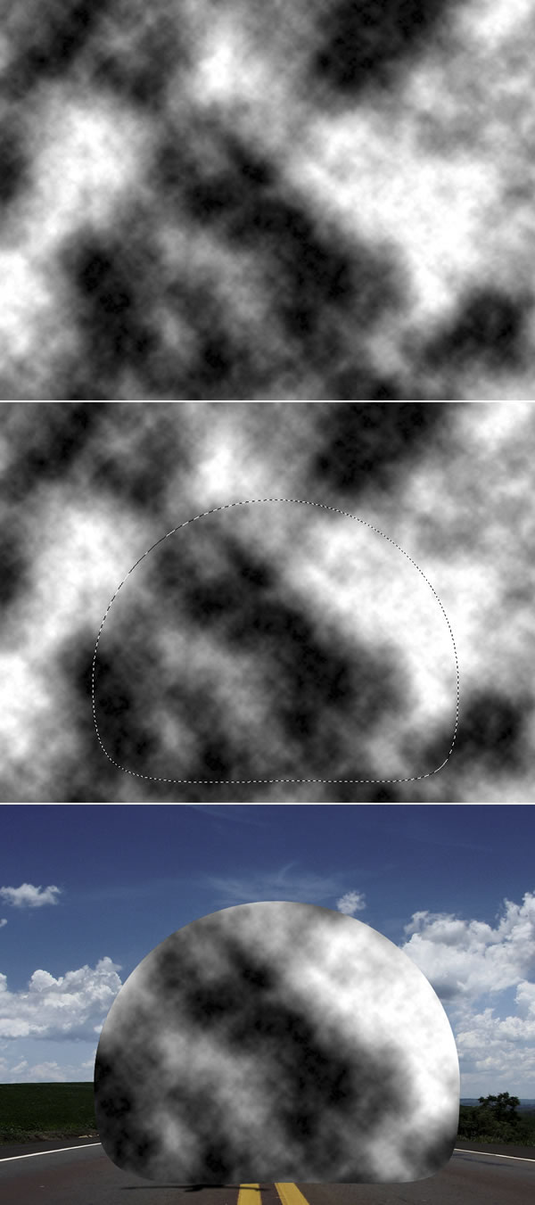
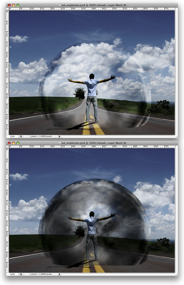
Create a new layer. Rename it to “clouds.” Then go to Filter > Render > Clouds. While holding Alt, click on Clouds. After that go to the Path’s Palette and create a selection from the path and mask the layer.
Tip: As you will be using the Render > Clouds, you will probably need to apply the filter several times until you got the clouds just right. Keep working with it until the light and dark areas are in a good position.
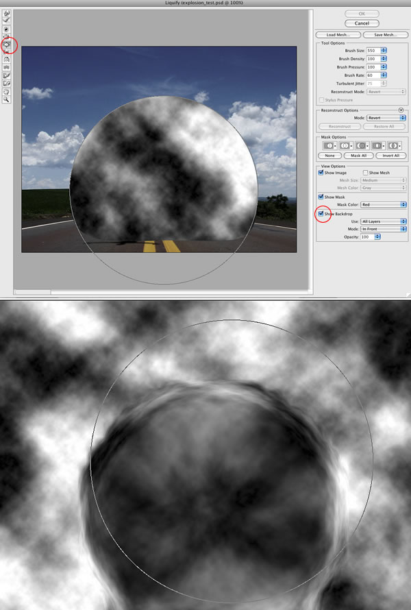
Step 8
Go to Filter > Liquefy. In the Liquefy Dialog Box select the Bloat Tool (B). Then for the settings use: Brush Size 550, Brush Density 100, Brush Pressure 100, Brush Rate 60, and Turbulent Jitter 75.
Then select the Show Backdrop Option. That will allow you to see the clouds and the background. It will be necessary to use the Bloat Tool in the right place. Click a few times and deselect the Show Backdrop. Then you will see the effect and will be able to repeat it more times in the correct place.
Step 9
Change the Blend Mode of the cloud layer to Soft Light. Then create another layer and rename it to “Clouds 2″ and repeat Steps 7 and 8. We will need another cloud to make it more turbulent. This time, however, use Multiply for the Blend Mode.
After that, create yet another layer. Rename it to “Clouds 3″ and repeat Steps 7 and 8. For this layer use Color Dodge for the Blend Mode. The last thing here is with the Eraser Tool (E) delete some parts. This layer is used to give highlights to the clouds.
Step 10
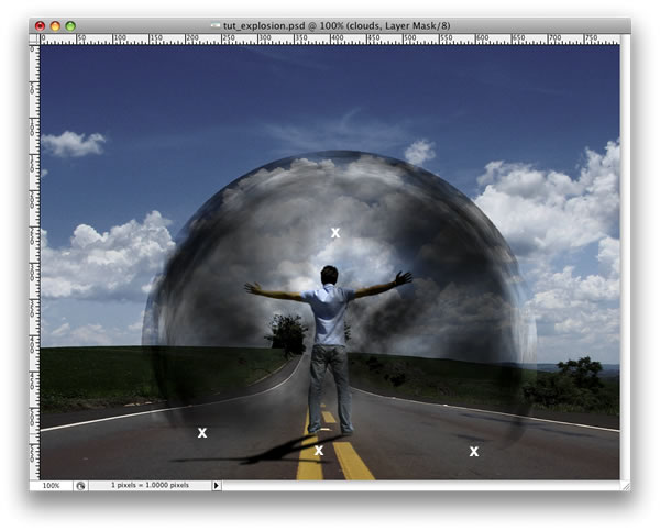
Group the “Clouds 3″ layer and go to Layer > Layer Mask > Reveal All. After that, select the Brush Tool (B), give it a black color, and mask some parts of the clouds that are close to the ground.
Step 11
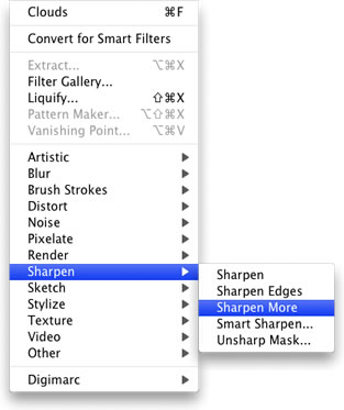
Select the “Clouds” layer and go to Filter > Sharpen > Sharpen More. Then repeat this Sharpen filter on Clouds 2 and 3 layers.
Step 12
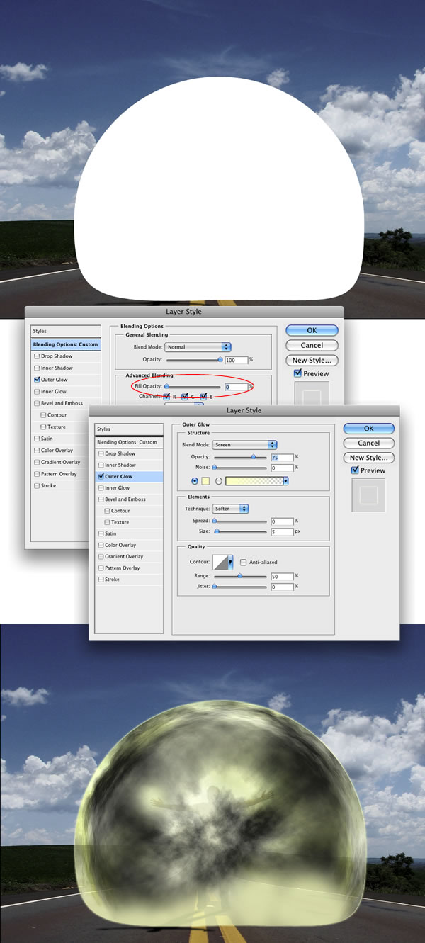
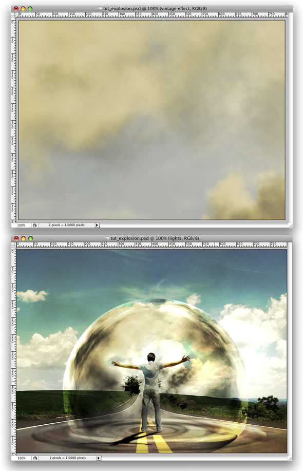
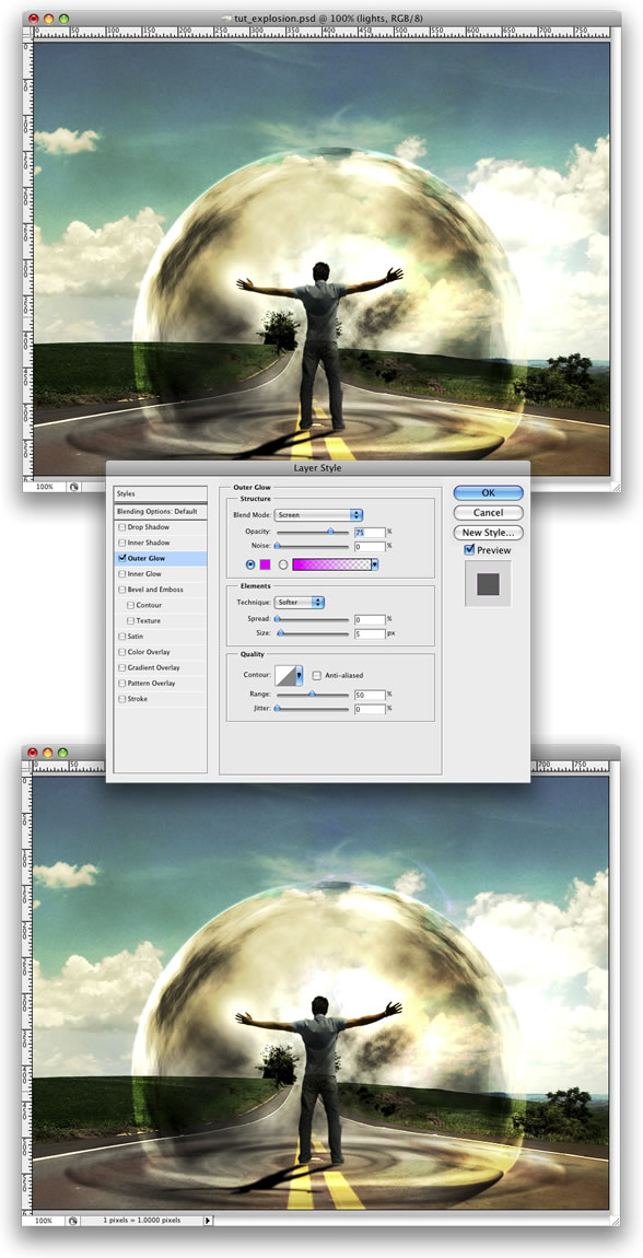
Create a new layer. Rename it to “Glow.” Fill it with white and go to the Path Palette. Create a selection from the clouds path as we did in Step 9. Then mask the layer.
After that go to Layer > Layer Style > Outer Glow. Use the default settings. Then go to Layer > Layer Style > Create Layer. This command will create another layer from the Outer Glow. You can delete the white layer and leave just the Outer Glow layer.
Step 13
Create a folder called “Lights.” Move the “Glow” layer to this folder. Next select the “Glow” layer. Then go to Layer > Layer Mask > Reveal All. Then select the Brush Tool, black for the color, and start masking the glow. We need just the outline; however, some bright spots in the middle will give a nice result.
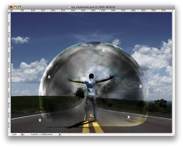
Step 14
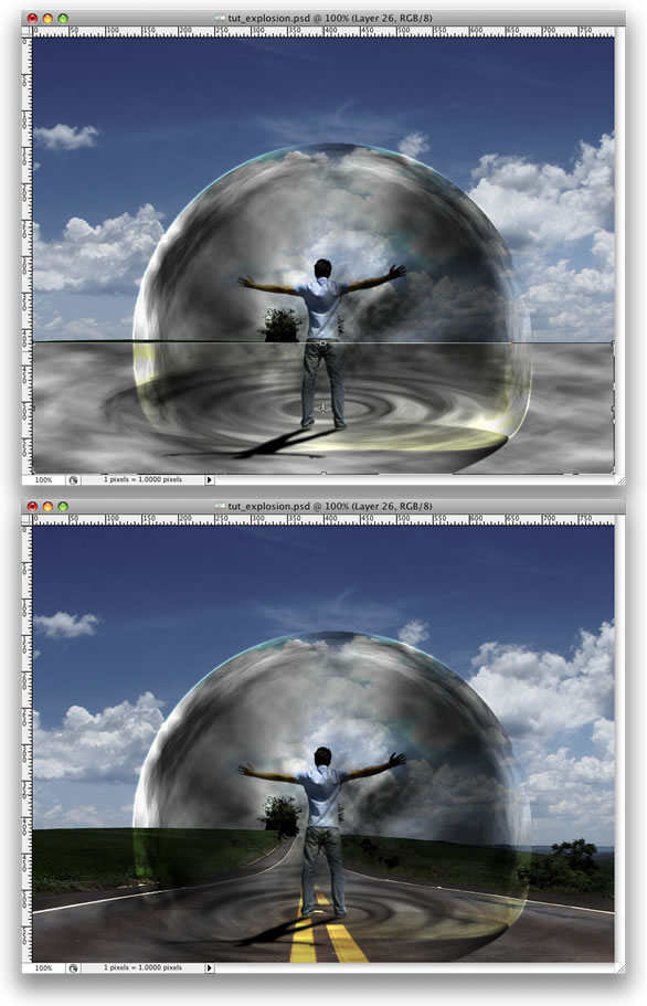
Create a new layer beneath the clouds group. Using the Elliptical Marquee Tool create a selection like the image below. Fill the layer with black and use 40% Opacity.
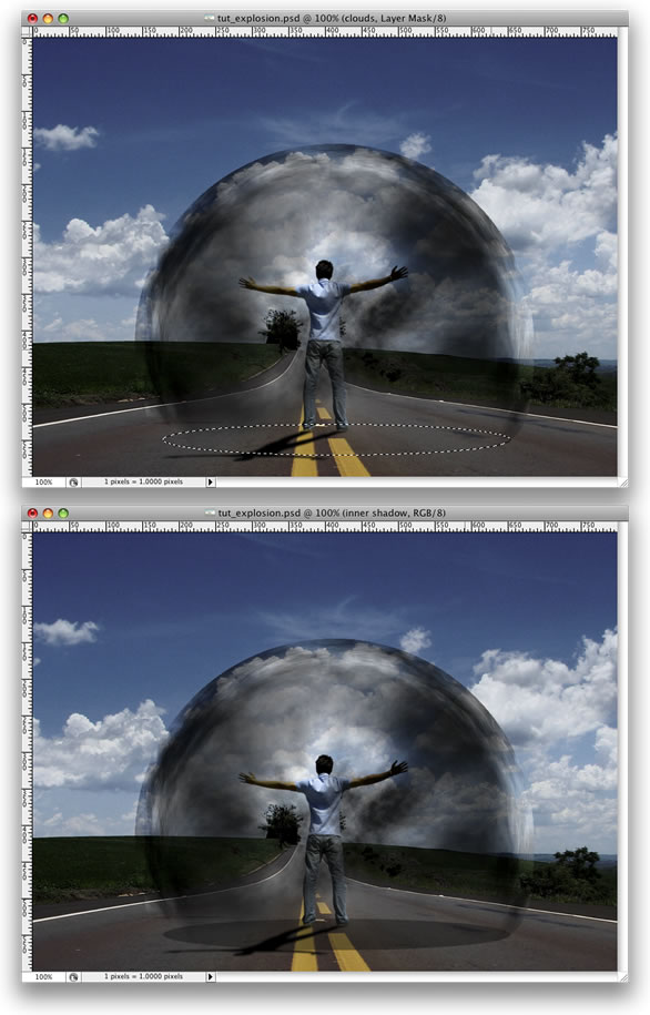
Step 15
Go to Layer > Layer Mask > Reveal All. After that select the Gradient Tool(G) and use a black and white gradient. Then mask the layer, like in the image below.
Step 16
Duplicate the layer and go to Layer > Layer Mask > Apply. Then go to Edit > Transform > Distort. Repeat the same thing we did for the shadow of the guy on this layer. Group these two layers and rename the group to “Shadows.”
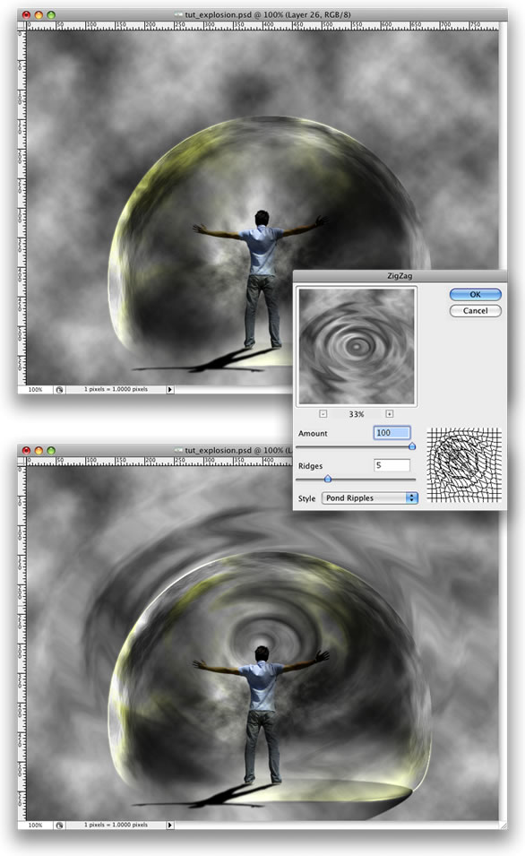
Step 17
Create a new layer right above the road photo. Go to Filter > Render > Clouds. Then go to Filter > Distort > ZigZag. Use 100 for the Amount and 5 for the Ridges. For the Style use Pond Ripples.
Step 18
Now go to Edit > Transform > Distort. Distort the layer until you get the right perspective. After that, change the Blend Mode to Overlay. Again, as we are using Render Clouds, the results may vary so you might need to erase some parts to make it more realistic.
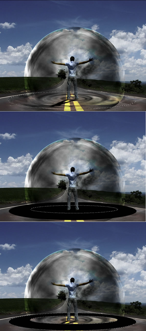
Step 19
Create an Elliptical Selection like the image below. Then fill it with black. After that, create another Elliptical Selection, but smaller. Then delete that part of the layer. With the Magic Wand Tool(W) select the black part of the layer.
Step 20
Duplicate the road’s layer and select it. Make sure that you still have the Marquee Selection from the Step 19. Then go to Layer > Layer Mask > Reveal Selection. You can delete the black ellipse layer from the Step 19 or just hide it.
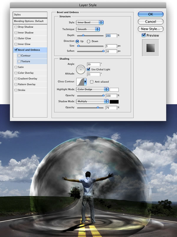
Go to Layer > Layer Styles > Bevel and Emboss. This is another way to create the ripple effect. You could use Displace as well.
Step 21
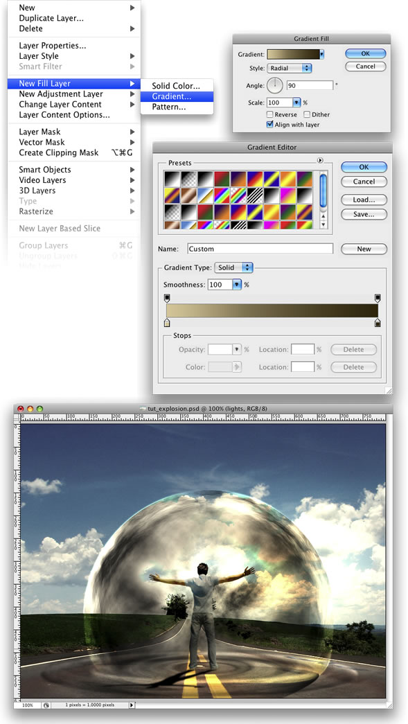
Go to Layer > New Layer Fill > Gradient. Use Radial for the Style. For the colors use #ddc396 and #2f1e00. Change the Blend mode to Color Dodge.
Step 22
Here I used another image from Stock.Xchng,
image. Just place it on top of all layers and change the Blend Mode to Overlay.
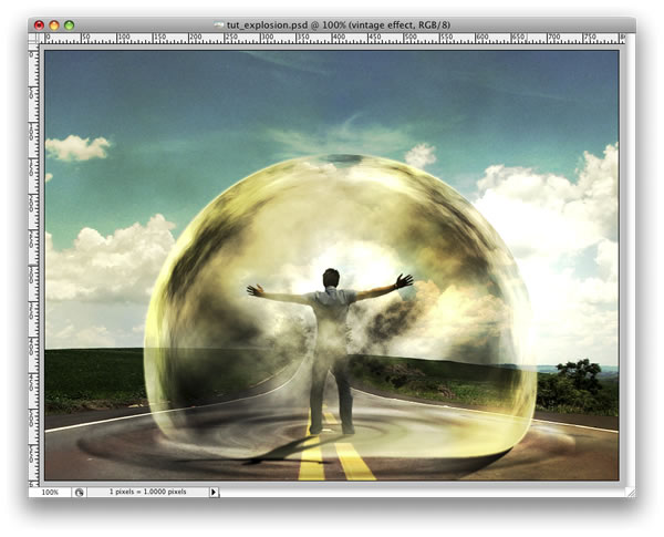
Step 23
Now let’s make some adjustments. First, lets darken our Magneto dude a bit more. Select the Burn Tool(S) and burn the back of the guy. After that, change the Blend Mode of the “ripples” layer to Soft Light. You can delete some parts of the clouds as well.
Step 24
Create a new folder, beneath the “dude” layer. Name the group “power” and change the Blend Mode to Color Dodge. After that, create a new layer inside of this group. Then using the Brush Tool with white color, create some lights coming from the hands of the guy.
Tip: use a regular brush with 0% for the hardness.
After that you create another layer. Use some brushes to add more effects. I used some abstract brushes from
http://brusheezy.com. Then add a Pink Outer Glow Layer Style.
Step 25
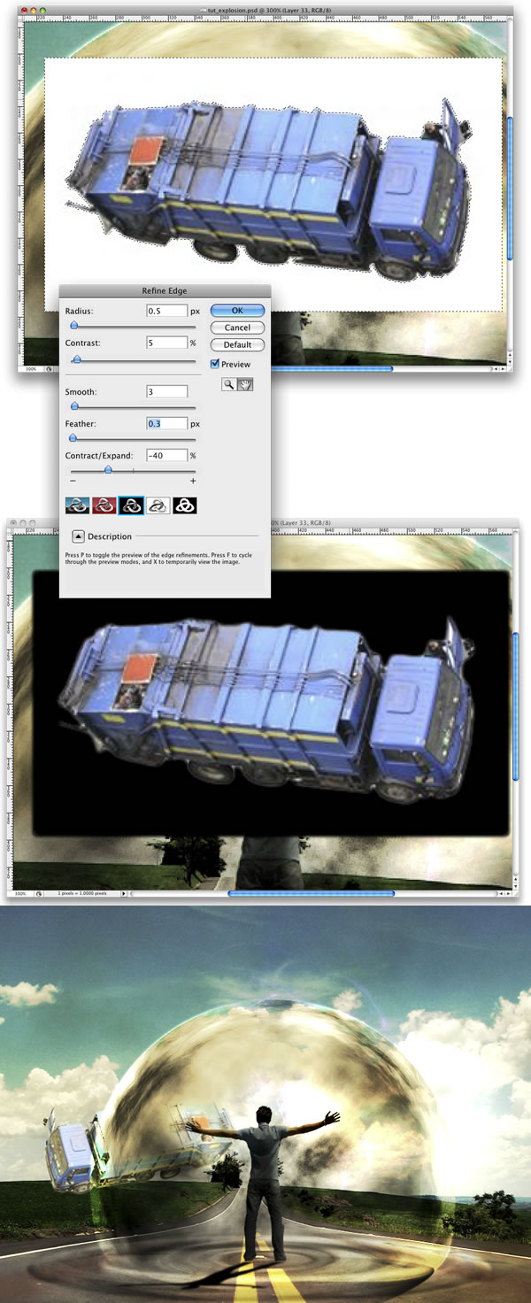
Import the truck image, you can download it at
image. Then with the Magic Wand Tool(W) select and delete the background of the photo. Leave just the truck. After that go to Edit > Transform > Flip Horizontal. Move the truck to the side of the road.
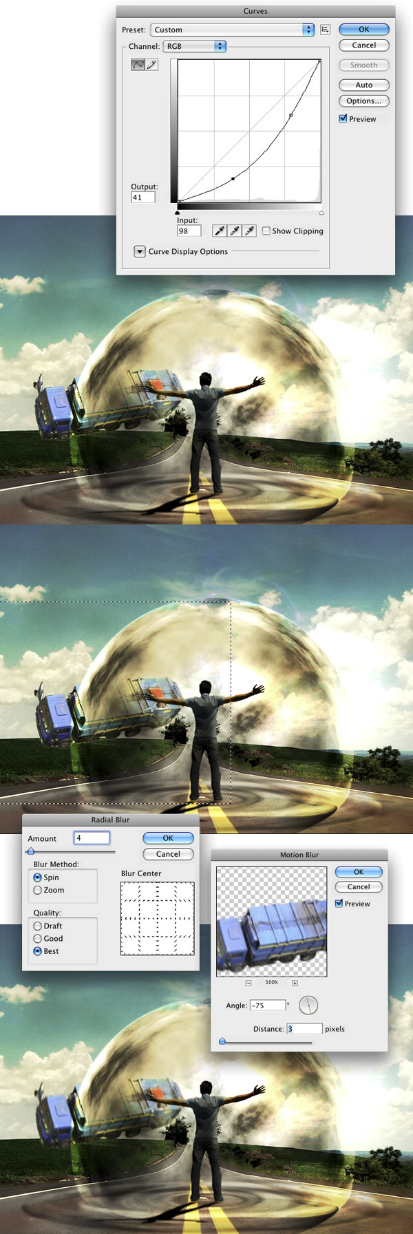
Step 26
Go to Image > Adjustments > Curves and make the truck a bit darker. After that, using the Rectangular Marquee Tool(M), create a rectangular selection a bit bigger than the truck. Then go to Filter > Blur > Radial Blur. For the settings use Amount 2, Method use Spin, and set Best Quality. Next go to Filter > Blur > Motion Blur. Then use -75 degrees for the angle and 3 pixels for the Distance.
Step 27
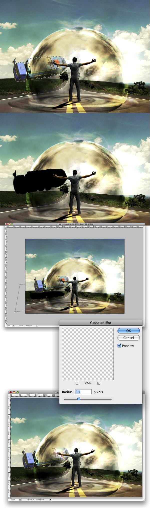
Now we will create the truck’s shadow. To do that select the Truck’s layer, click with the right button of the mouse and choose Select Pixels. Then create a new layer and fill it with black. Put this layer beneath the truck layer and go to Edit > Transform > Distort. Distort the shadow to make it look more real. Then go to Filter > Blur > Gaussian Blur. Change the Opacity of this layer to 60%.
Step 28
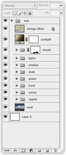
Group the truck and the shadow layer and rename it to “truck.” Then organize your folders in the Layers Palette.
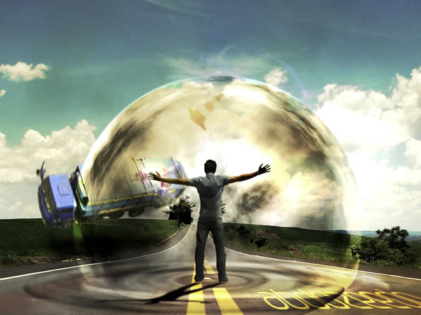
Conclusion
You can add more elements to the image, like a traffic cone or more cars. But always change the curves in order to make the objects have the same lighting. That will make the image more realistic. For some effects, there will be many other ways to achieve a similar result. Experiment with different methods of achieving an effect, like we did with the ripples. Finally, stick with the ones you think are the best for that image.

Step 1: Duplicate The Background Layer
With our image newly opened inside Photoshop, we can see in the Layers palette that we currently have one layer, the Background layer, which contains our image:

The original image on the Background layer in the Layers palette.
We need to duplicate the Background layer, and we can do that using the keyboard shortcut
Ctrl+J (Win) /
Command+J (Mac). Now when I look in my Layers palette now, I can see that I now have two layers - my original Background layer on the bottom and a new layer, "Layer 1", above it which is my duplicate:

Press "Ctrl+J" (Win) / "Command+J" (Mac) to duplicate the Background layer.
Step 2: Add More Canvas Space To The Bottom Of The Document
We're going to add our water reflection below the image, so let's add some canvas space to the bottom of our document to make room for our reflection. To do that, go up to the
Image menu at the top of the screen and choose
Canvas Size. This will bring up Photoshop's "Canvas Size" dialog box. The easiest thing to do here is to add twice as much canvas space as what we currently have, but we only want it to appear at the bottom of the document, not above it or on either side, so we need to tell Photoshop exactly where we want this extra canvas space to go.
First, enter
100 for the
Height and set the measurement to
percent, as circled in red below. Leave the Width option set to 0. Then make sure the
Relative option is checked, which tells Photoshop to give us 100% more canvas space than what we already have. Below the "Relative" option is a 3x3 grid of squares. This is where we tell Photoshop where we want to place our additional canvas space. Click inside the square in the middle of the top row (again as circled below). This tells Photoshop not to place any of the extra canvas space above the document and instead to place all of it at the bottom:

Add more canvas space using the "Canvas Size" dialog box.
Click OK to exit out of the dialog box, and Photoshop will add the extra canvas space to the bottom of the image:

x
The height of the document has now been doubled with the extra canvas space added to the bottom.
Step 3: Flip The Top Layer Vertically
In order to create our reflection, we need to flip our image upside down, so let's do that.
With the top layer selected in the Layers palette, go up to the
Edit menu at the top of the screen, choose
Transform, and then choose
Flip Vertical.
Photoshop will flip the image upside down in the document:

Go to Edit > Transform > Flip Vertical to flip the image on the top layer upside down.
Step 4: Drag The Flipped Image To The Bottom Of The Document
We need the flipped image to be at the bottom of the document, so grab your
Move Tool from the Tools palette, or press
V on your keyboard for the shortcut:

Select the Move Tool.
Then, with the Move Tool selected, click inside the document and drag the flipped image down to the bottom until the top of it is lined up with the bottom of the original image above it. Hold down
Shift as you drag to make sure you drag down in a straight line:

Drag the flipped image down below the original.
Step 5: Add A New Blank Layer
Now that we have our flipped image in place, we can begin to create our water ripple effect. First, we need to add a new blank layer at the top of the Layers palette, so with "Layer 1" still selected, click on the
New Layer icon at the bottom of the Layers palette:

Add a new blank layer to the document.
Step 6: Fill The New Layer With White
We're going to fill our new blank layer with white. If white is not currently your Background color, press
D on your keyboard, which will reset Photoshop's Foreground and Background colors, making black your Foreground color and white your Background color. Then use the keyboard shortcut
Ctrl+Backspace (Win) /
Command+Delete (Mac) to fill the new layer with the Background color (white). Your document will be filled with solid white.

The entire image is now filled with white.
Step 7: Apply The "Halftone Pattern" Filter To Create Black And White Horizontal Lines
Go up to the
Filter menu at the top of the screen, choose
Sketch, and then choose
Halftone Pattern. This brings up Photoshop's Filter Gallery (in Photoshop CS and higher) set to the "Halftone Pattern" filter options on the right, with a large preview of the effect on the left. We're going to use this filter to add a series of black and white horizontal lines to the image. These lines are going to become our water ripples . The more lines we have, the more ripples we'll have. First, we want to make sure we're creating lines and not dots or circles, so set the
Pattern Type option to
Lines. We control the number of lines by adjusting the
Size option. Lower values give us more lines, since we're lowering the size of each line, and higher values give us fewer but thicker lines. I'm going to set my Size value to 7, which I think works best for my image. You may want to experiment with this value on your own. The
Contrast option below it determines how sharp the edges of the lines are. Lower values give you softer lines, white higher values give you hard edge lines. Set this value all the way to
50 to give your lines sharp edges. We're going to soften them ourselves with the Gaussian Blur filter in a moment:

Adjust the Halftone Pattern filter options to create a series of black and white lines through the image.
Click OK when you're done to exit out of the dialog box, and Photoshop will fill the image from top to bottom with your black and white lines:

The image is now filled with black and white horizontal lines.
Step 8: Apply The "Gaussian Blur" Filter To The Lines
Before we can use our black and white lines as water ripples , we need to smooth them out and create nice, smooth transitions between them. To do that, go up to the
Filter menu once again, choose
Blur, and then choose
Gaussian Blur, which brings up the "Gaussian Blur" dialog box. Keep an eye on your image and drag the slider at the bottom of the dialog box to increase the
Radius value until the lines have a very soft edge to them. I'm using a small image for this tutorial, so for me, a Radius value of about 4 pixels works well. If you're using a larger, high resolution image, you'll need to set yours to a higher value:

Use the Gaussian Blur filter to smooth out the edges of the lines.
Click OK to exit out of the dialog box and apply the blur to the lines.
Step 9: Duplicate The Lines Layer As A New Document
We're going to create a brand new document out of our lines layer, which we'll then use as our displacement map for our water ripples . With the lines layer selected, go up to the
Layer menu at the top of the screen and select
Duplicate Layer, which brings up the "Duplicate Layer" dialog box. In the "Destination" options, click on the down-pointing arrow to the right of the
Document option and set it to
New, which will create a new Photoshop document out of our layer:

Set the "Document" option in the "Duplicate Layer" dialog box to "New".
Click OK to exit out of the dialog box, and your layer will open up in a new document on the screen.
Step 10: Save The New Document And Close Out Of It
This new document that we've created is going to become our displacement map, but before we can use it, we need to save it. We're also going to close out of it after we've saved it, since we won't need it open anymore, and the easiest way to accomplish both of those tasks is to simply close out of the document. When you try to close out of it, Photoshop will as you if you want to save the document before closing it. Click
Yes:

Choose "Yes" when Photoshop asks if you want to save the document before closing it.
Photoshop will bring up the
Save As dialog box. You can name your new document anything you like. I'm going to name mine "water-ripples". Make sure you save it as a Photoshop .PSD file, since those are the only files that Photoshop can use as a displacement map. You'll probably want to save the document to your Desktop, since we'll need to find it again in a moment.
Step 11: Delete The Lines Layer
Now that we've used our black and white lines to create the file we'll be using as our displacement map, we can get rid of it. To do that, simply click on it and drag it down onto the Trash Bin icon at the bottom of the Layers palette:

Click and drag the lines layer ("Layer 2") onto the Trash Bin at the bottom of the Layers palette to delete it.
Step 12: Merge The Two Layers Onto A New Layer
Before we can add use our displacement map, we need to merge our two image layers onto a new layer above them. To do that, with "Layer 1" selected, use the keyboard shortcut
Shift+Ctrl+Alt+E (Win) /
Shift+Command+Option+E (Mac). Nothing will appear to have happened in the document, but if we look in the Layers palette, we can see that both layers have been merged onto a new layer at the top:

Both layers are now merged onto a new layer, "Layer 2".
Step 13: Use The "Displace" Filter To Create The Water Ripples
We're ready to create our water ripples using the displacement map we just created. With the new merged layer selected in the Layers palette, go back up to the
Filter menu at the top of the screen, choose
Distort and then choose
Displace .
This brings up Photoshop's "Displace" filter dialog box. This is where we determine the strength of our ripple effect, and we do that with the
Horizontal Scale option at the top. I'm going to set mine to a value of 4, which will give me a realistic ripple effect. You may want to experiment with this value with your own image. Setting it too high though will create too much of a horizontal distortion and you'll lose the realism.
We don't need any vertical distortion to create our effect, so set the Vertical Scale option to 0. Also, make sure that Stretch To Fit and Repeat Edge Pixels are selected:

Go to Filter > Distort > Displace to bring up the Displace dialog box.
Click OK in the top right corner of the dialog box, and Photoshop will ask you which file you want to use as your displacement map. Choose the file that you just saved a moment ago, which I saved to my Desktop as "water-ripples.PSD", and then click Open. Photoshop will then apply the displacement map to the entire image, creating our water ripples :

The image after applying our displacement map with the "Displace" filter.
Step 14: Hide The Ripples On Top With A Layer Mask
Of course, we have a slight problem at the moment. We've added our water ripple effect to the entire image, and we only wanted it in the bottom half. We can fix that easily though using a layer mask. First,
Ctrl-click (Win) /
Command-click (Mac) directly on the thumbnail for "Layer 1" in the Layers palette to place a selection around the flipped image at the bottom of the document:

"Right-click" (Win) / "Control-click" (Mac) directly on Layer 1's thumbnail in the Layers palette to place a selection around the flipped image.
You'll see a selection appear around the bottom half of the image in your document. Now, with the merged layer still selected, click on the
Layer Mask icon at the bottom of the Layers palette:

Click on the "Layer Mask" icon to add a layer mask to the merged layer at the top of the Layers palette.
Photoshop will add a layer mask to the merged layer, and because we had a selection around the bottom half of our document when we added the layer mask, only the bottom half of the merged layer remains visible. The top half becomes hidden from view, removing the unwanted water ripples from that part of the image:

The ripple effect is now hidden from the top half of the image after applying the layer mask.
Learn Photoshop with Photoshop Effects Tutorials at Photoshop Essentials.com
Step 15: Apply The "Gaussian Blur" Filter To The Layer Mask
Before we add our finishing touch by colorizing the water , let's soften the edge of the layer mask a little so there isn't such a harsh dividing line between the image on top and the water below. We'll use the Gaussian Blur filter for that, and since we want to apply it to the layer mask, we'll need to first select the mask. We can do that by clicking on the layer mask thumbnail in the Layers palette:

Adobe Photoshop Tutorials: Click on the layer mask thumbnail in the Layers palette to select the layer mask.
You can tell that the layer mask is now selected by the white highlight box around its thumbnail. We're going to apply the Gaussian Blur filter to the mask, so go back up to the
Filter menu, select
Blur once again, and then select
Gaussian Blur. When the dialog box appears, simply click OK to apply the same Radius value we used previously.
Step 16: Colorize The Water With A Hue/Saturation Adjustment Layer
Let's finish things off now by adding just a hint of blue to our water, and we'll use a Hue/Saturation adjustment layer for that. We want the adjustment layer to only affect the bottom half of the image where the water ripples are, so hold down your
Alt (Win) /
Option (Mac) key, click on the
New Adjustment Layer icon at the bottom of the Layers palette, then select
Hue/Saturation from the list of adjustment layers:

Hold down "Alt" (Win) / "Option" (Mac), click on the "New Adjustment Layer" icon, then drag your mouse to "Hue/Saturation" to select it.
By holding down "Alt/Option", this tells Photoshop to bring up the
New Layer dialog box before adding the adjustment layer. Select the
Use Previous Layer To Create Clipping Mask option by clicking inside the checkbox to the left of it:

Select the "Use Previous Layer To Create Clipping Mask" option in the "New Layer" dialog box.
This option tells Photoshop that we want the adjustment layer to affect only the layer directly below it in the Layers palette, and since the layer below it is the layer containing our water ripples , only the water ripples will be colorized, which is what we want. Click OK to exit out of the dialog box.
This will bring up the Hue/Saturation dialog box. We want to colorize our water, so the first thing we want to do here is select the
Colorize option in the bottom right corner. Then select the color you want your water to be by dragging the
Hue slider at the top. I'm going to drag my slider to the right to a value of about 218, which I think is a good color for my water :

Use the Hue/Saturation dialog box to colorize the water .
Click OK to exit out of the dialog box , and you'll see that your water on the bottom has now been colorized, but the color is much too strong at the moment.
Step 17: Lower The Opacity Of The Hue/Saturation Layer
To reduce the intensity of the color we just added to the water , all we need to do is go up to the
Opacity option in the top right corner of the Layers palette and lower the opacity value. I'm going to lower mine all the way down to about 25%, which adds a much more realistic amount of color to the water :

Lower the opacity of the adjustment layer until the water has only a hint of color to it.
Once you've lowered the opacity of the adjustment layer to reduce the color intensity of the water , you're done!
Here once again is my original image for comparison:

The original image once again.
And here is my final "water reflection" result:
The final effect.
Just for fun, here's another example of the exact same effect applied to a different image. The only thing I changed here was that I only added half as much canvas space below the original image (I set the "Height" value in the Canvas Size dialog box to 50% instead of 100%). Everything else was done exactly the same way:

Another example of an image using the same effect.
Age Progression - Photoshop Tutorials
Disclaimer:
None of the given Photoshop Tutorials are written by me. They are all taken from various sources on the Internet and I compiled some of them for you. Hope you understand. More are in the line.
Here’s a little tutorial showing you how I basically go about aging a woman’s face in Photoshop.
Preface
I've been asked several times by different members to post a tutorial on how I age-progress a person. So, here it is!

Men and women age a little bit differently but since I've only aged female celebrities thus far, I'll just focus on women for this tutorial. I’ll be using the image of Katie Holmes that I did for a past W1K contest, as an example.
Step 1: Choosing an Appropriate Photo
When deciding to age-progress a celebrity’s face, I try to select a picture that is touched-up as little as possible.

I find that candid shots, or any shots that have not been taken in a studio, work best because the resulting harsh lighting reveals more of the skin’s details i.e. slight bags under the eyes and faint wrinkles. The appearance of such details makes it all that much easier to visualize how your subject will age. Visualizing what the end result will look like brings you one step closer to aging her face realistically.

In Katie’s case, we can see very faint horizontal lines on her forehead, fairly obvious lines under her eyes and lines bracketing her mouth.
Step 2: Collecting Reference Material
Reference material is key in my method of aging. Keeping Katie’s face in mind, I scoured the Web, looking for faces of old women who either resemble Katie and/or share the same facial expression. Here, Katie is smiling with her face positioned at a 3/4 angle so I tried to gather as many pictures of old women who are smiling in the same manner or close to that. I then opened up the picture of Katie in Photoshop and pasted the found images around her face on a separate layer, spread out to provide easy visual access.

Another kind of reference I like to use but is usually hard to find, is pictures of the subject’s parents. I managed to find a couple of reference pictures of Katie’s mother online and they really helped me to decide whether or not to give Katie a double chin. Since her mom has quite a bit of mass under her chin, I decided I would apply that to Katie too.
Step 3: Thinning Brows
Now the fun begins! The first thing I like to do is to thin out the subject’s eyebrows and eyelashes. The older people get, the thinner their hair gets - either because hair falls out and/or because it dries out as it greys.

So to achieve this, I like to use the Clone Stamp tool at 100% with a relatively small brush size depending on the size and resolution of the image. I sampled the surrounding skin to thin and reduce the number of hairs.
Step 4: Mold the Face
Next, I like to add the basic sags to the skin. I do this in the Liquify mode. I tried to create sagging effects to the cheeks, jowls and the cliff just above the eyes by using the Push tool. For the eyes, I tried to be subtle; otherwise she may end up looking somewhat ghoulish.

From what I’ve learned about the aging process, I know that while bones cease to grow, and in fact shrink, cartilage does continue to grow. As a result, the end of a nose may appear larger as a person grows older. So while I was still in the Liquify mode, I used the Push tool to extend the length of the nose slightly. Then I used the Bloat tool to also enlarge it slightly, being careful not lose the essential quality or character of the nose. Go too far and it may not look like Katie anymore.
Step 5: The Aforementioned Double Chin

Based on her mother’s pictures, I then added a fairly massive double chin. I initially used the Airbrush tool with some fairly broad strokes, sampling the colors that were already in the area of her neck. I then worked in the details with a finer brush size. Also, keep in mind that I was also using the other reference photos of older women to guide me.
Step 6: Wrinkle Up the Eyes
For me, the most important parts to get right are the eyes. They can make or break the project. Done wrong and the picture may no longer be identifiable as one of Katie Holmes anymore. I sought out the fine lines around the eyes and I tried to imagine how they would progress into wrinkles. I then extended them in length and width accordingly. Referencing the pictures of old women helped a lot with this step.

I used a combination of the Stamp tool and Brush tool. I wish I could explain my technique at this point in a more clinical manner but mostly I relied on my artistic instincts. I emphasized the wrinkles around the eyes by widening and deepening the lines slightly and increasing the contrast by darkening the recesses and lightening the edges. Also, I extended wrinkles to the cheekbone areas. I then applied the same technique to the wrinkles around the mouth and to the forehead.
Step 6: Reducing the Lips
In this step, I work on the lips. As people grow older, the outline of the lips tends to recede. Using the Stamp tool, I sampled the skin surrounding the lips and thinned them out.

While I was at it, I also added a few vertical wrinkles above the lips to give her a bit of a "prune" effect. We just want a hint of that, so don’t carve out deep lines; deep lines would only be necessary if she was puckering her lips.
Step 7: Planning Out More Wrinkles

Here, on a separate layer, I faintly outlined or sketched, with a relatively thin brush size, areas that I may or may not add more lines and wrinkles to. It’s easy to get carried away with the addition of wrinkles. So, I stopped, took a step back and assessed where to take to image. For me, it's essential and a great test to see what best works.
Step 8: Touching Up the Wrinkles
Based on the previous step, I added wrinkles where I thought they were needed most.

Overall, I found that the wrinkles and lines seemed a little flat in comparison to the rest of Katie’s features. They needed more definition so that they could pop out more. So, I highlighted the raised edges of the individual lines with the Brush tool and with a lighter skin tone.
Step 9: Hairy Lips
Facial hair becomes an issue with most women as they age. For some strange reason they lose it in the brow area and grow it back around the mouth area. I didn’t want Katie to be the exception so with a very fine brush size and the Brush tool, I added hairs to her upper lip.

I tried to make it as subtle as possible. Hairs too thick or dark would draw the viewer’s attention straight to her mustache and I didn’t want that. I also added more wrinkles to the area below the corners of her mouth.
Step 10: Refining the Neck

I decided that the neck was too smooth for a woman of 75 years of age. So I added finer wrinkles to that area. Also, I added more mass and weight to her jowls with the airbrush by increasing the value of the tones in those areas thus creating more contrast between surface planes.
Step 11: Adding Age Spots
A key component to effective aging of a face is the addition of age spots.

So at this point, I sampled one of the darker skin tones on her face, and on a separate layer that was set to Multiply and 30% opacity, I brushed them in and tried to create irregular shapes (there IS no perfect age spot). You can add as many as you like; the amount varies from person to person. I decided to be conservative with Katie.
Step 12: More Refinements
I took a little break from it and came back to it later to possibly get a better perspective on it. When I looked at it, at this point, I decided that certain areas needed refining and added detail. This is the beauty of working with a high-resolution file; I can zoom in real close and deal with a wrinkle up-close and personal.

Unless their teeth were subjected to regular whitening, most people’s teeth yellow with age. Gums also recede, showing less gum and more bone. And so with that in mind, I sampled a yellowish-brown color and on a new layer that was set to Multiply and 30% opacity and painted that color to the teeth with the Brush tool. Her gums didn’t show to begin with, so receding the gums here wasn’t necessary.
Step 13: Preparing the Hair

The finishing touch here is greying the hair. I began by creating a mask defining the area of the hair. I used the brush for this and tried my best to define as many loose strands of hair that I could.

With this mask as a selection, I then created a Hue/Saturation adjustment layer and reduced the saturation to –63.

I then created a new adjustment layer based on the same mask and adjusted the Brightness/Contrast to brightness +9 and contrast –36. As a result, I found that the darker areas were too pale and caused a loss of depth and so to adjust that, I then selected the mask and scratched out the darker areas with a 5px brush size at 50% opacity so that they could show through from the original image.
Step 14: Hair Raising
The next step was to raise the hairline and thin out the hair. Hair loss is common with both sexes.

I sampled the area at the top of the forehead and extended the skin area above the original hairline.
Step 15: Greying the Hair
A lot of details of the hair were lost in the previous step so with a thin brush size at 80 percent opacity I drew in fine grey hairs, sparsely laid out.

Patiently, slowly, stroke by stroke I added more and more hairs until I was happy with the amount of grey I had added.
Step 16: Finishing Touches
Finally, I took a step back, refined a few wrinkles here and there ET VOILA!

I hope this tutorial was insightful. It may not be the most technically detailed tutorial but it gives you a good idea of the process I go through to get the job done. Hopefully, it will help you create your own trophy-winning images for future Fountain of Age contests! Watercolor Effect
June 28th, 2007 in Photo Edit, Tutorials by kailoon
As my tutorial had been choose for the
Top Ten in June by NI-LIMITS BLOG. Now I continue my job and share my photo edit tricks with all my fellow readers.
Step 1
Open an image, I will use this image because it suit to my tricks.
Step 2
CTRL + J, duplicate the image. Now you will have a layer which labeled as “
layer 1�.
SHIFT + CTRL + U, desaturate the image and you will get something like this:
Step 3
CTRL + J again to
duplicate layer 1 and you will get a new layer which labeled as “
layer 1 copy�.
CTRL + I to
invert the layer and set the layer blend mode to
Color Dodge. Go to
filter > other > minimum > 1.
Double click on layer 1 copy to bring out the
blending option.
ALT + left click on the triangle and set the underlying layer as below:
Step 4
CTRL + E to
merge up both layers.
CTRL + J, duplicate layer 1. Select
layer 1 copy and go to
filter > blur > Gaussian Blur > radius 6. Set the layer blend mode to
linear burn.
CTRL + J on
layer background and put the layer
background copy at the
top of all layer and set the layer blend mode to
color.
Step 5
Hope you are still with me. Select layer
background copy and
add a layer mask, fill it with
black color.
Step 6
Still with the layer background copy, go to image > adjustment > curve and set as below.
Step 7
Create a
new layer and put it
top of all layer. Fill it with
#ffecd1. Set layer blend option to
linear burn.
Step 8
We are nearly there, now select
layer 1 and set the
opacity to
60% or whatever you think suitable. Select the
background copy layer’s mask, with a
45px soft brush,
opacity 65%, brush the
face area. Here is it!
The difference:
Examples:
Hope you guys enjoy this! Thanks!
The first you open this picture, press Ctrl+J to duplicate layer then change blend mode: Soft light

Cut the lady out of background (Feather=5)

Move the lady to the first picture, press Ctrl+B to open Color Balance, set
information like this:

Press Ctrl+J to duplicate lady layer, blend mode: Screen and adjust Opacity of layer copy: 70%. You will get the result:

Open cloud stock, use Elliptical
marquee tool to make selection like this (Feather=20)

Move selected part of cloud to background, use Free Transform (Ctrl+T) to make it fit in background, change blend mode: Screen

Duplicate cloud layer, use Free Transform (Ctrl+T) to reverse layer copy then move it to bottom of background

Get Moon from this stock, feather 10px:

Move moon layer to background and put it under cloud layer. Press Ctrl+B to open Color Balance and set information like this:

You will get:

Use Elliptical Marquee Tool to draw a lozenge then click Right mouse, choose Stroke: white, 1px

Dupliate lozenge layer to make another layer copy (about 5,6 layers) then sort them like this:

Merge all lozenge layers to one layer then open Layer Style, set information like this:


Go to Filter -> Radial Blur:

Duplicate one more layer to make the ribbon lighter, then continue merge them to one, change blend mode to Hard light, you will get:

Duplicate layer, use Free Transform to revolve lozenge like the picture below:

Put some birds over cloud and you will have:

Move "paper" stock to background then change Blend mode to Linear Burn:

Open Color Balance (Ctrl+B) of paper layer, set information like this:

And this is my final result:
(Click on the picture below to see full size)


 16.16
16.16
 zichs81